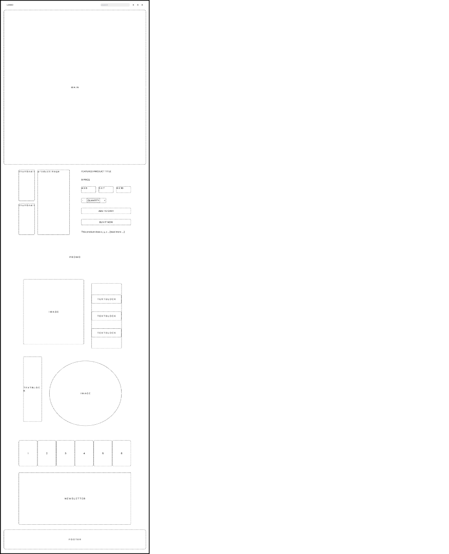
Wireframe I was given this wireframe for the design layout of an e-commerce store for digital products. My goal was to keep the layout as close to the wireframe a possible, while adding a certain aesthetic that would make the webpage stand out to the user. During this stage I brainstormed a color scheme, blue was the only color choice I was given and thus had to come up with a suitable color palette. I chose Yellow as the CTA buttons because yellow grabs attention and because it matches well with the color blue. Usng color psychology yellow evokes happiness, it represents energetic and fun and the products used on the design are exactly that; fun and energetic.
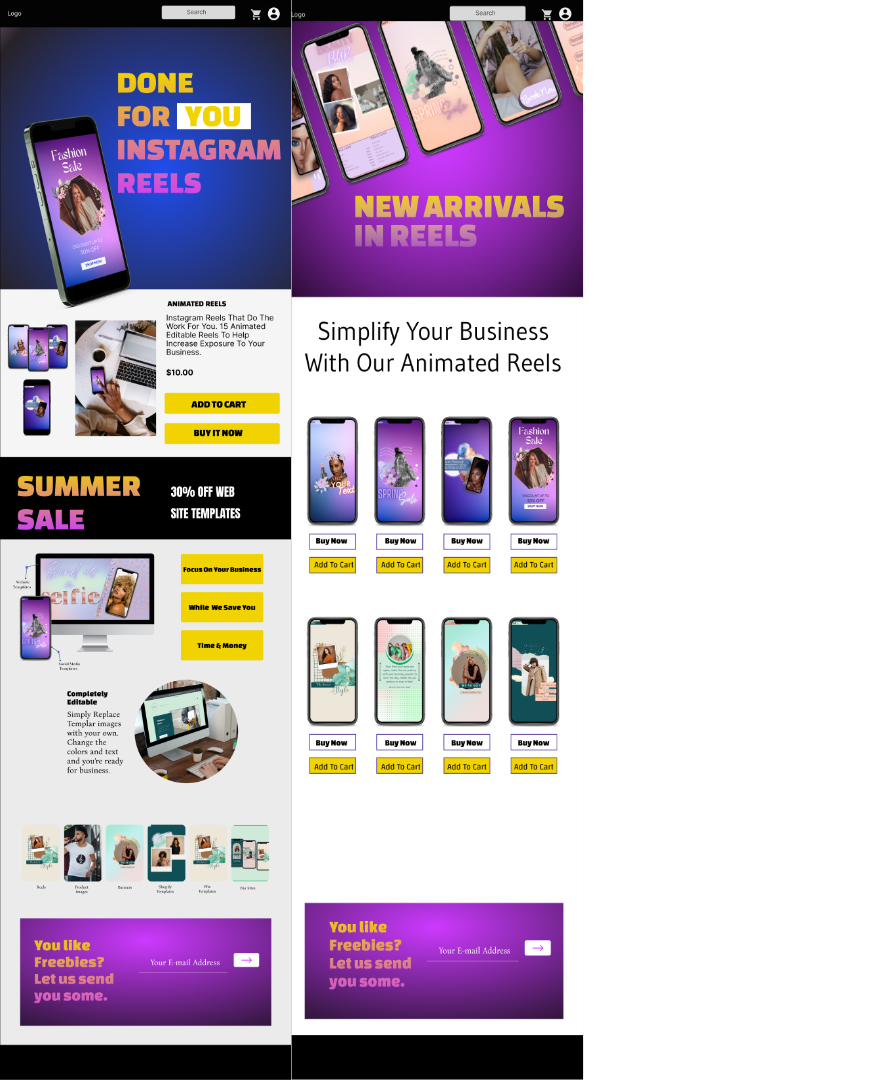
These Prototypes represent the homepage, derived from the wireframe and the collection page I chose a bold hero image for the home page so it would stand out to the customer. I modern design elements by highlighting the word 'you' so the customer feels like the product is specific to them. The hero image on the collection page displays an array of reels to show that there are options for the customer to choose from. I chose to immediately follow up with various collections of the product in different colors with CTA buttons to encourage the purchase. I did't want to add anything else that could be a distration so this page focuses on getting sales.
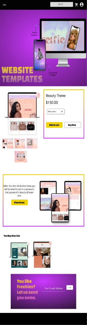
When creating the product page the focus was to highlight the product itself by placing an image of a template in the hero image followed by the actual product for sale.
I added a link with a demo attached, so the customer as the ability to test the product out. In designing these high res images I was thinking about the customer's user journey
and what actions were needed to get them to make the purchase.
I followed with displaying similiar products and an email capture which will encourage the customer to fill out with an incentive
in case they were not ready to yet purchase.